After you add a gallery to the Apps section of your theme template, you can adjust it to match the design of your store. Below are the settings you can change in the Shopify theme editor.
Choose which gallery to display
- If you're adding a gallery to a product template, choose whether all products in the template share the same gallery settings or a specific product gets its own settings.
- If you're adding a Custom Gallery to a page, you can change the page where the gallery appears.
Demo mode
Demo mode shows how your gallery will look on your store once it's filled with photos. Test photos are displayed in the theme editor only — your customers won't see them.
Custom widget width (px)
Set a fixed widget width in pixels, or enter 0 so the gallery adapts to the width of your theme's container.
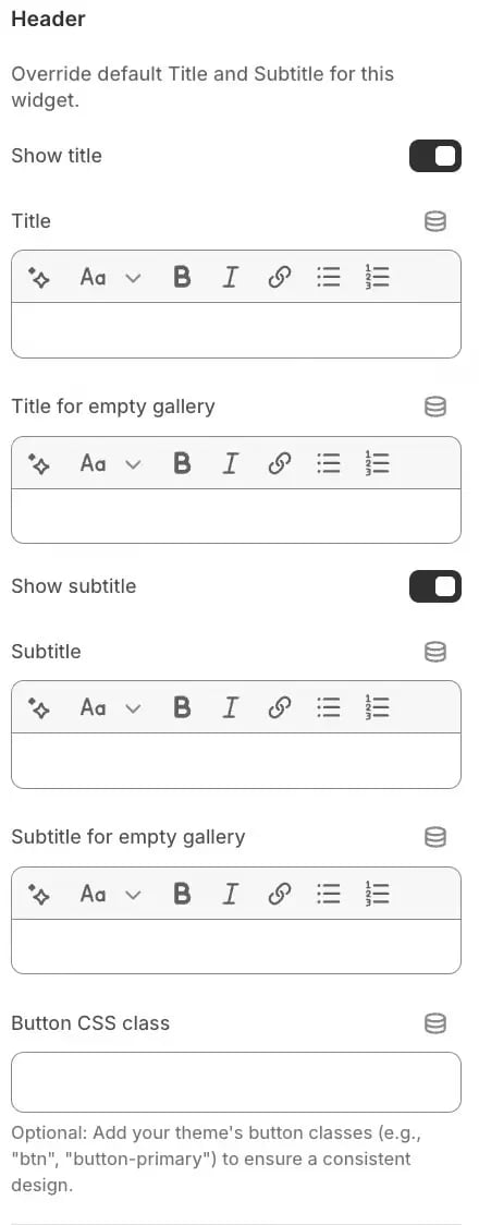
Header
Configure the gallery texts. You can set separate texts for a gallery that already has photos and for an empty gallery:
- Title and Title for empty gallery — if you don't need a title, turn the toggle off.
- Subtitle and Subtitle for empty gallery — if you don't need a subtitle, turn the toggle off.
- Button CSS class — add the CSS classes your theme uses for buttons so the Upload button matches your store's design.
Layout settings
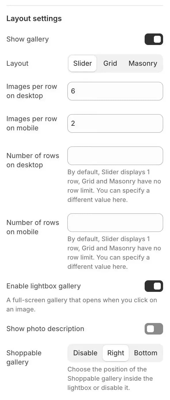
Customize how the gallery looks when it has photos, including the number of photos shown on desktop and mobile:
- Show gallery — turn the gallery off if you no longer need it on your store.
- Layout — choose one of three modes:
- Slider — the gallery keeps the same size on the page, and customers browse photos with the slider.
- Grid — all photos are shown at once, so the page gets longer as the gallery grows.
- Masonry — photos of different sizes are arranged in a mosaic without gaps, for a dynamic, modern look.
- Images per row — set separately for desktop and mobile.
- Number of rows — set separately for desktop and mobile.
- Enable lightbox gallery — customers can open a photo in full-screen mode and swipe to the next one.
- Show photo description — customers can see the description that you or other customers added to a photo.
- Shoppable gallery — choose where product cards linked to a photo appear in the lightbox: Right (default) or Bottom, or disable them for this widget. On mobile devices, the cards always appear at the bottom. Each card shows the linked product with a View Product button, and customers can temporarily hide the cards with the tag icon.
Slider settings
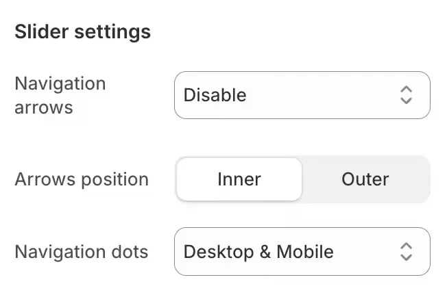
Configure how the gallery slider looks and works:
- Navigation arrows — disable the arrows completely or show them only on a specific device type.
- Arrows position — Inner or Outer.
- Navigation dots — disable the dots completely or show them only on a specific device type.
Upload form settings
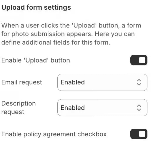
These settings control the pop-up form customers see when they upload a photo to the gallery. Adjust them to match your store's policies and needs.
Customer uploads are allowed by default. If you don't want customers to upload photos to the gallery, disable the Upload button.
Other options:
- Email request — Enabled, Disabled, or Enabled and Required.
- Description request — Enabled, Disabled, or Enabled and Required.
- Enable policy agreement checkbox — to link your privacy policy in the checkbox text, add a standard HTML link, for example
<a href="your-link">privacy policy</a>, to the consent text field on the Settings page (Edit / Translate texts tab). The link opens in a new tab for your customers.