On the Edit / Translate texts tab of the Settings page, you can edit and translate all customer-facing texts of the Customer Photo Uploader widget.
Main configuration
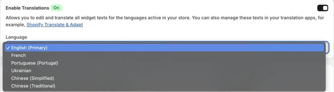
- Enable Translations — turns on the translation feature. When it's on, you can edit the widget texts for every language active in your store. You can also manage these texts in Shopify translation apps, such as Shopify Translate & Adapt.
- Language — select the language you want to edit. The primary language is selected by default.


Edit text
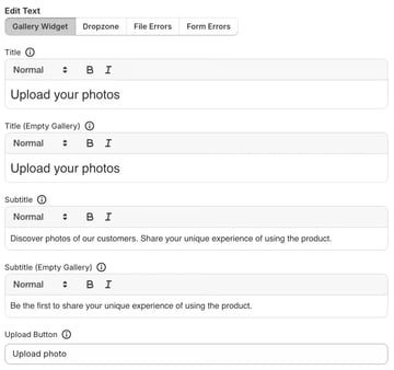
This block lets you edit the texts your customers see when they interact with Customer Photo Uploader galleries. It's organized into four tabs:
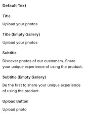
- Gallery Widget — texts of the main gallery display.
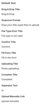
- Dropzone — texts of the file upload pop-up.
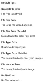
- File Errors — messages for file-related errors, such as a file that's too large or in the wrong format.
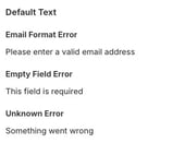
- Form Errors — messages for errors in the submission form.
Gallery Widget fields
- Title — the main heading above the gallery.
- Title (Empty Gallery) — the heading shown when the gallery has no photos yet.
- Subtitle — the descriptive text below the title.
- Subtitle (Empty Gallery) — the descriptive text shown when the gallery is empty, encouraging the first upload.
- Upload Button — the text on the button that starts an upload.
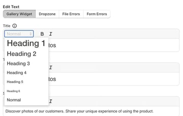
Each text field supports basic formatting — bold and italic — and you can choose the heading size.
Dropzone fields
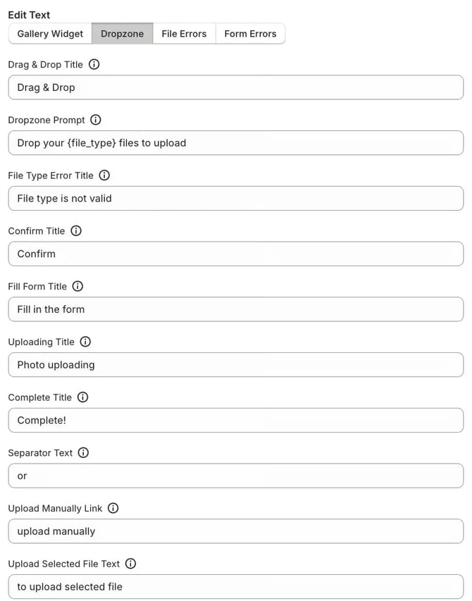
This tab covers all texts of the file upload pop-up, including upload states, form fields, and messages:
- Drag & Drop Title — the main heading of the drag-and-drop upload area.
- Dropzone Prompt — the instruction inside the uploader, usually listing the accepted file types. The
{file_type}variable is replaced automatically. - File Type Error Title — the title shown when a customer tries to upload a file of an unsupported type.
- Confirm Title — the text of the confirmation prompt, for example the Confirm button.
- Fill Form Title — the heading that asks the customer to fill in details, such as email or description, after selecting a file.
- Uploading Title — the status text shown while a file is uploading.
- Complete Title — the status text shown after a successful upload.
- Separator Text — a short text separating two actions, such as the drag-and-drop area and the manual upload link.
- Upload Manually Link — the link that lets customers browse their device for a file.
- Upload Selected File Text — the text next to the selected file name, prompting the customer to proceed.
- Change Photo Link — the link that removes the selected file so the customer can choose another one.
- Change Your Photo Link — the link that lets the customer change an already uploaded photo.
- Close Popup Link — the button or link that closes the uploader pop-up.
- Allowed File Types — informational text listing the permitted file types, using the
{file_type}variable. - Maximum File Size — informational text showing the file size limit, using the
{file_size}variable. - Uploaded Message — the success message shown after the photo is uploaded and submitted.
- Upload Button (Dropzone) — the text of the main Upload button in the pop-up.
- Upload More Button — the button that lets the customer upload another photo after a successful submission.
- Email Input Label — the label of the email field.
- Email Input Placeholder — the example text inside the email field.
- Description Input Label — the label of the field for a photo description or caption.
- Description Input Placeholder — the example text inside the description field.
- Privacy Policy Checkbox — the agreement text next to the privacy policy checkbox. It supports bold and italic formatting and heading size. To add a link to your privacy policy, see the upload form settings of the gallery widget.
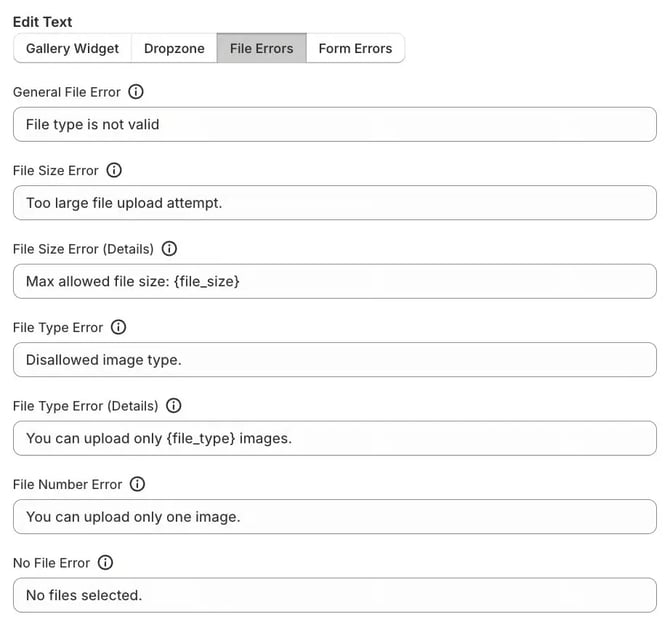
File Errors fields
Customize the error messages shown when something is wrong with the uploaded file:
- General File Error — a generic message for any file-related issue.
- File Size Error — the main message shown when a file exceeds the size limit.
- File Size Error (Details) — a detailed message with the maximum allowed size, inserted with the
{file_size}variable. - File Type Error — the main message shown when a file type isn't supported.
- File Type Error (Details) — a detailed message listing the allowed types, inserted with the
{file_type}variable. - File Number Error — shown when a customer tries to upload more files than allowed, for example two files when only one is permitted.
- No File Error — shown when a customer tries to submit without selecting a file.
Form Errors fields
Customize the error messages for the submission form fields, such as email or description:
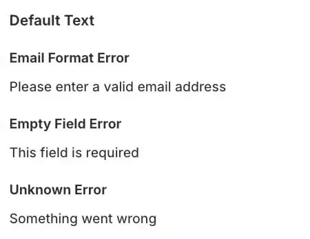
- Email Format Error — shown when the email field doesn't contain a valid email address.
- Empty Field Error — shown when a required field, such as Email or Description, is left blank.
- Unknown Error — a generic message for unexpected errors during submission.
Default text
The Default text section on the right side of the page shows the original default text for each field in Edit text. Use it to see what a text was before your changes or to copy it back if you want to revert.